
Today's advice specifically relates to the use of RGB vs. Grayscale images. More specifically, in instances where the book will be eventually released as both a B&W interior print version, as well as a PDF copy.
So, to begin, here's today's piece of advice...
If you're going to have a B&W interior (including grayscale images), and you know your product will be release in a PDF version, then make sure your source photos are in Grayscale..

Now let's answer the question, "Why grayscale?" There are two answers to this...
First, it actually makes for a more visually consistent (i.e., "professional looking") PDF. Check out the Digiskleros example from the Original Petty Gods PDF vs. the Expanded Petty Gods layout. In the first example, from OPG, notice the sort of "greenish" tone in the image? Now look at the 2nd example from EPG. Notice the consistency and richness of the black tones. Now, look a the 3rd image, where I take the greenish version from OPG and show it in the EPG layout.
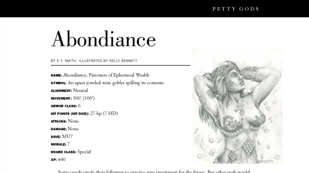
Original Petty Gods with RGB Abondiance.
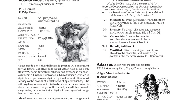
Expanded Petty Gods with grayscale Abondiance.
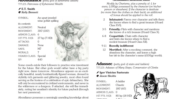
Expanded Petty Gods with RGB Abondiance "pasted in."
That alone should be enough reason to do it. But there's a second and equally-compelling reason. And it all comes down to file size limitations and restrictions. All of the OneBookShelf companies (including RPGNow, where most of us distribute our PDFs) have very established guidelines for production, but the following two, when taken at face value, are VERY misleading...
– All Images are RGB colorThe reason they want images as RGB is because they are assuming the images themselves are in color, and if saved as CMYK, they would be tremendously larger. You'd think they would only be 25% larger, but a CMYK file size can often be more than 300% larger than it's RGB counterpart (it all has to do with file compression algorithms; or so the petty god of desktop production has told me).
– All Images are 150 dpi/ppi
Because grayscale images have less digital information in them, they tend to be smaller than their RGB counterparts. This means a couple of things for you... 1) it's okay to make your images grayscale, even though OneShelf says they need to be RGB, and 2) when your program compresses your file to make the smallest PDF it can, it will actually retain more "in between" information for your image (color images, especially JPGs, "squeeze" out a lot of the details of an image), meaning it will look a lot better on screen and when it prints from your desktop! Oh, and if you want that image to hold more detail, then always go with with TIFF over JPG.
Now, all this being said, for any artists sending me Petty Gods art, please just keep sending me the file types you would normally send!!! I'm doing any sort of adjustments and conversions on my end, to maintain as much production quality as possible! So, if you've sent me RGB JPGs in the past, then just keep doing the same, and I'll worry about all the stuff I noted above!
Coming soon... I discuss the power of the "Levels" control in Photoshop.

Very informative! I will keep this in mind if I ever put together a PDF with artwork.
ReplyDeleteYou can easily make another PDF of all your tips & tricks for making great looking PDFs....
Serious artists transmit in PGN or TIFF, as they are lossless formats. JPG even at the highest image quality settings, destroys the fidelity of images.
ReplyDeleteI agree with you Nate, TIFF and PNG were the formats I used in a past life as a graphic artist. However, because I know the end result is a PDF I'm sending 100% jpegs. As a musician and recording artist, I've experienced the same in the music industry with mp3s. Because most folks listen to music through substandard speakers anyway, or via download/streaming, the fidelity expectations have been lowered considerably.
ReplyDeleteA discussion of bitmap images for line art would also be worthwhile. I see too many DIY D&D publications with fuzzy line art because the images were saved as grayscale.
ReplyDeleteThat will actually be part of my discussion about the levels controls in Photoshop.
Delete