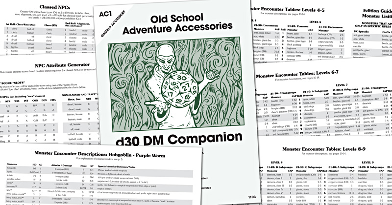
Here's what I've got so far...
CHARACTER GENERATION SECTION
Classed NPC Geneator: Creates 900 Oe/1e base types (about 450 BX)
The “Complete” NPC: Creates 27,000 combinations of traits/personality/quirks
Non-classed NPC Generator: 27,000 variants of Merchants, Traders & Misc.
Added Skills: 30 secondary skills to create more “well-rounded”/unique NPCs
Attribute Generator: quick attribute generation for classed/non-classed NPCs
Character Motivations: 30 character motivations for freelance adventurers
EXAMPLE CLASSED NPC ROLL-UP (Took less than 1 minute)
CL: Druid | R: Elf | S: Female | AL: Neutral | L: 4TH
STR: 15 | WIS: 16 | INT: 10 | CON: 10 | DEX: 13 | CHA: 16
Physical Trait: Scarred | Personality: Mysterious | Quirks: Pyromaniac | Motivation: Duty, Group
The fact that she's a druid, scarred, mysterious and pyromaniac gives me a real sense of who she might be. From the profile, I'd guess that she has the spell Produce Flame but maybe not Protect from Flame. I'm also guessing she belongs to some sort of weird cult (given her background and motivation.)
MONSTER ENCOUNTERS
Monster Encounters Overview: includes a d30-based bell-curved chart for # App.
Monster Encounter Tables: Tables for Monster Encounters by Level (1-9)
Monster Encounter Descriptions: Basic Stats (HD, AC, etc.) for 140+ Monsters and 14 Human/Humanoid types (includes table of monsters listed that appear only in specific rules editions)
Next up... TRAPS & TREASURE
I've already got the traps page done and a couple of pages of treasure, but have plans to continue to flesh this out with the goal being "as much depth and detail as possible in as few rolls as possible." Let's face it, when you're at the table and you need something quick, you need something quick. Am I right?


Those are looking great!
ReplyDeleteThanks! I'm pretty happy with how it's looking. It took me a long time to work out the interior typeface and size. I wanted something that could be 1) set small (to allow more on the page), 2) still be legible, and 3) felt old-school. I feel like I did a pretty good job of accommodating and balancing all three. Also, I'm so excited about the back cover illustration that it may become the front cover illustration.
ReplyDelete